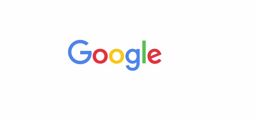
"Google has changed a lot over the past 17 years — from the range of our products to the evolution of their look and feel," the company writes in the intro of a YouTube video announcing the news. "And today we’re changing things up once again…" The company writes that its new "simple, uncluttered, colorful, friendly" logo better reflects the different ways people interact with Google on their smartphones, watches, TVs, cars, or desktop computers.
The news comes not long after the big cooperate restructuring that turned Google into a subsidiary of a new parent company called Alphabet, run by Larry Page. This logo swap is the first dramatic change we’ve seen so far under new Google CEO Sundar Pichai.
 Google
Google’s previous logo switch-up came last May when it oh-so-subtly changed the positioning of the second "g" and the "l."
Here’s the logo change from 2014 before:
And here’s the logo that Google introduced today:
Obviously, this new change is a lot more dramatic, and its "flat" sans-serif look more closely aligns with the material design aesthetic that Google launched with Android Lollipop in 2014.
Here are a few other Google logos throughout the years:


